Hello friends! This has been on my mind for a while & it’s a really important topic we don’t often acknowledge (or act on). The information in this post is honestly super easy to access by just Googling, but I thought it was important enough that I share it directly coming from me, rather than posting links. Still, I’d always highly recommend looking further into the topic!
But anyways–accessibility. What is it?
Accessibility (in this case) is the practice of making your websites & social media usable by as many people as possible. In my tips, this mostly applies to making things more accessible to screen readers, but it would also range to captioning, for those who are hard of hearing or deaf, as well as other actions so people can have the best reading/viewing experience possible while looking at your online pages.
It’s not just about making your pages better, but more specifically about making your pages better so all people can access them.
I am absolutely not an expert on disability or what it’s like to use different aids on the Internet, but I do want to bring this to more people’s attention, especially in the book community, so we can be more mindful about the world & people around us. If you see anything I get wrong, I’d always appreciate a nudge so I can remedy that & make sure I’m not spreading misinformation, but you’re absolutely not obligated to do this. Or if there’s something you find important that I missed! I’d love to hear about it.

Accessibility Issues on All Platforms
Below are things nearly universal to all platforms that should always be kept in mind.
Unicode Text (different fun (?) texts)
This is a personal pet peeve of mine because it’s just. The embodiment of people favoring aesthetics over accessibility.
On platforms that don’t allow us to use different fonts or bold our text, there are websites where you can get cute fancy fonts–things that look like cursive, things that are italicized and bolded, things that have strikethroughs.
But these are really annoying for screen readers, because the cute fancy text is made from a collection of mathematical/non-normal text symbols, which causes screen readers to read them as their long name, rather than treating them as letters. Which is not a fault of the screen readers.
𝘩 reads as “mathematical sans-serif italics small h.” That’s just one letter. To fully understand this, please listen to the video below of a screen reader reading a tweet.
So I urge all of you to avoid using these symbols in your tweets, posts, and display names. It makes your platform basically inaccessible to people who use screen readers. (And hard to find in the search bar.)
What does this mean for emojis? I’m not an expert, but I’ve believe emojis don’t have ridiculously long names. Obviously the ones that are like text-emoji faces like ( ͡° ͜ʖ ͡°) and ASCII art are annoying to read aloud, but traditional emojis like 😳 are okay in moderation, I believe.
Screenshots of Text
This is pretty obvious, but when you screenshot text and post it as a picture, screen readers can’t read it. You need to include alt-text or a caption that says the same thing so people are able to access this information.
I go into more specifics on how to do this on different platforms below.
Captioning
Videos should be captioned! Not only because subtitles are great, but also for those who are deaf or hard of hearing. Whether it’s in a YouTube video or a clip, if there’s audio, it is strongly recommended to add captioning!
Flashing Lights
Whether it’s on Twitter, Instagram, or Youtube, please be careful about posting videos with flashing lights and rapidly changing colors. Exposure to videos with flashing lights at certain intensities and patterns can trigger seizures for some people with epilepsy.
To make this safe without having to alter your content, please put a warning before in order to let people scroll past it without endangering their health.
Using Color
This is helpful for people who value both aesthetics and accessibility. The short version is to just be smart about the colors you choose to put on top of each other. Both in terms of
- red-green colorblindness
- people who have low vision, low contrast vision, or color vision deficiency who are not able to read content as easily if there is bad contrast
Having high contrast and colors that pop and don’t vibrate against each other will not only make your posts more accessible, but it’ll also almost always make your content prettier as well. If you’re concerned about a color combination, look up Color Contrast Checker to have the contrast quantified.
:max_bytes(150000):strip_icc():format(webp)/Color-Contrast-Chart-59091b973df78c9283e31928-8f0e8f537b1a48d2b8961afa04bc6928.jpg)
Content Warnings
Content warnings (also known as trigger warnings) are very important for people who may be triggered by certain content. The point is to warn people that triggering content will be coming up soon, and that this is their opportunity to skip past.
For a list of things that traditionally get warnings, feel free to look up “What to Include Content Warnings For.”
Content warnings are useless if the triggering content is present immediately after the warning.
The most crucial part is to make sure there is enough space between the warning & triggering content to let readers skip or scroll past quickly.
It can still be tricky to navigate. We need to keep in mind that
- Some people may be triggered by the word itself.
- Some people mute words from their timeline so they don’t have to see it.
For the first bullet point, we can consider blocking out a letter to mitigate the effect. Like V*cky vs. Vicky, as an example of blocking out a letter so the word is less intense.
But, if your post only has this as a warning, people who muted the word “Vicky” will still see it show up, because the word “Vicky” doesn’t actually appear in your post. So we might also include the word in full, but considerably further down so people can scroll past it.
There is no one good way to go about content warnings, but please consider the multiple facets of this topic, and the best way to warn readers about triggering content.
Accessibility on Blogs
Below are things to think about when writing for a website, like a blog or potentially Tumblr. Please keep in mind that I primarily talk about this with reference to either HTML or WordPress.
Semantic Tags vs. Style Tags
When we go to bold or italicize a piece of text, there are actually different ways to do so. If you check the HTML, you will likely either see a strong or a b tag to make something bold, or an em or i tag to make something italicized.
<strong>This is HTML for text in bold.</strong>
<b>This is HTML for text in bold.</b>
<em>This is HTML for text in italics.</em>
<i>This is HTML for text in italics.</i>
However, there is a clear difference between strong and bold, and em and i. Strong and em tags semantically emphasizes the text as important or emphasized. B and i tags only stylistically/visually make the text bold or emphasized.
Most of the time, this isn’t important. But if you have a piece of text that is like, “Every bolded word spells out a secret message” but you only use b tags rather than strong tags, screen readers will not read the b tags, but they will read the strong tags.
WordPress defaults to strong and em tags. But if you’re writing the HTML yourself or on a platform where you’re not sure, please keep this in mind & check.
To check on the new WordPress dot com, click the meatball dot dot dot menu that appears when you’re on a block and select “Edit as HTML” to check.
Headings
Headings are visually very important to helping us skim content. Big headings mean most important thing, smaller headings mean sub information.
It works the same way for screen readers. There are different categories of headings in HTML–Title (and H1), H2, H3, H4, etc. Screen readers can skim web pages for users, and to skim it, it uses the different categories of headings. Lower numbers mean higher priority.
So if you’re using a heading format as an aesthetic rather than for organization, this can seriously trip up screen readers and make it more difficult to look at your web page.
Proper heading use and nesting is important!
To check on the new WordPress dot com, you can click the information (i in a circle) button on the upper left corner of a post, and if there’s something wrong with your nesting, it will alert you. Alternatively, you can just click your heading blocks and see what they are.
Alt-Text
Naturally, using alt-text applies to images on your blog! Looking up “Alt Text Examples” will provide a good reference point as to how to write it.
To add alt-text in WordPress, you can either
- go to the Media Library, select the image you uploaded, and click “Edit” to add the alt-text to an image file
- when you add an image without uploading to the Media Library, you can also click the Settings button in the top right corner, click the image, and there should be information for “Image Settings” > “Alt-text.”
- Edit the image as HTML by click the image, using the meatball menu to edit as HTML, and then coding it in manually.
<img src="imag_link.com" alt="the alt-text"/>

I generally do not recommend adding alt-text as a caption. If you do not check the image’s alt-text, there is a chance that it had something weird and nonsensical as alt-text from where you retrieved the image. (Looking at you, Goodreads who puts in a random string of numbers.)
Naming Links
This is one I wasn’t aware of until I was doing final research skims for this post!
But in general, it’s good to say where the link goes to in the text that is linked. A good example of naming links would be:
Read more about Vicky’s blog, Vicky Again.
A bad example would be:
Read more here.
Adding a descriptor for what the link links to helps screen readers (and people in general) know what you’re linking to, without reading the full URL.
Accessibility on Instagram
Instagram in general isn’t really a very accessible platform, especially with regards to IG stories. Any text that’s typed is immediately rasterized so it can’t be read with voice to text, aka all story posts are rendered into images. However, there are still ways we can make the platform more welcoming & accessible.
Captioning Audio on IG Stories
Although there’s not much we can do about using screen readers with IG stories, it’s still extremely helpful for people who are deaf or hard of hearing to have captions for audio on Instagram stories.
It is most definitely a little tedious to do it manually & type it out, but there are apps (Clipomatic) that can automatically do it, and then you can edit anything it mishears. However, I do believe most of the apps available are paid.
Alt-Text
Did you know you can add alt-text to each image in your Instagram posts? This will allow you to avoid putting alt-text in your captions.
When you are adding the caption to your post, you can scroll all the way down and there should be a small button that reads “Advanced Settings.” Under the “Accessibility” tab, there’s a button to allow you to write alt-text for each image.
It’s recommended that you put your alt-text in both the alt-text and the caption–because if your text needs to be translated to another language, the alt-text won’t translate but the caption will. Huge thanks to Sam @ spines in a line for letting me know about this!
Accessibility on Twitter
Many of the universal information applies to Twitter, especially the unicode text.
Alt-Text
In the past, you used to need to enable alt-text in your settings to be able to add it. However, now everyone should be able to do so quickly.
When you add an image to a tweet on web or in the app, there should be an “Add description” button near the bottom. You can use this to add alt-text.
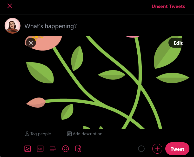
Alternatively, the Edit button will bring you to the page where you can crop the image, and there should be a tab to add alt-text.
Simple, quick, and easy!
There are bots on Twitter that read out alt-text in a tweet or help people who need an image captioned by alerting someone to come caption an image, but it’s still responsible for us to add alt-text to our images. There’s a pretty high character limit, so there’s really no need to put it in a follow-up tweet.
Capitalization of Hashtags
Thank you to Adriana White for letting me know about this & add it!
Capitalizing each word of a hashtag–like #VickyWhoReads instead of #vickywhoreads–helps screenreaders read the hashtags properly! Without the capitalization, it makes it more difficult to differentiate the individual words in the tag (and we all know how vickywhoreads can be read differently . . .)
I’m not entirely sure how this applies to Instagram and Tumblr, but definitely something to keep in mind!
This is only a start to the ways we can make our social platforms accessible. The book community is such a diverse and welcoming space, and I hope this post was not only helpful, but motivated you to make some tiny changes in the way you post content!
If you have any questions, please feel free to ask me! Even if it’s silly things like you can’t figure out where a button is.

This is such a good, helpful post! I wasn’t aware of some things yet, but I’ll defintiely try to do better and make my platforms more accessible. Thank you, this was really helpful ❤
LikeLiked by 1 person
Of course! I’m glad you could learn something & that it helped!
LikeLike
This is a really great post!!
LikeLiked by 1 person
Thank you! I hope it was helpful!
LikeLiked by 1 person
thank you so much for this post, vicky!! i have such a long ways to go in making my blog and social media more accessible, so this was the perfect tutorial for me. i honestly had no idea how awful the fancy text was for screen readers – i’m definitely not using that going forward!! :(( again, thank you for this! i really appreciate all of the tips you shared 💖
LikeLiked by 1 person
of course! i’m super happy everything was helpful and that you can now make your social media accessible to more readers! ❤
LikeLiked by 1 person
Thank you, even as a screen reader user I learnt things from this post, especially regarding social media.
You worded everything well in regards to screenreaders and the missing alt text is my biggest pet peeve. Or for example, headings and prompts (e.g. in booktags) in graphics. They are the worst. There is not much attention/awareness about this and I thought of making a post about it. Are you okay if I translate this post to Dutch for my followers?
If you are self-hosted, there is a plugin by UserWay for the accessibility on your blog. I have installed it.
LikeLike
WOW! My mind is so blown. I’ve always valued accessibility but you brought up so many things I have never thought of like the HTML tags and colours. I definitely have areas to improve. I am a strong proponent of captioning videos/images, especially on social media like IG where people are posting long videos without captions. Thank you for this post!
LikeLiked by 1 person
Yes! I’m so glad I could help you find more things about accessibility. It’s always really interesting to see how our websites and stuff have spaces for it that we can take advantage of.
LikeLike
[…] wrote an in-depth post on how to make your blog and social media more accessible, and I learned so many new things from […]
LikeLiked by 1 person
[…] Vicky’s Post on How to Make Blogs/Social Media More Accessible – Vicky discusses the importance of making sure content is accessible to screen readers or those […]
LikeLiked by 1 person
This such an important post and it was really helpful!
LikeLiked by 1 person
Yay! I’m happy to hear that!
LikeLike
[…] Vicky @ Vicky Again […]
LikeLiked by 1 person
[…] Vicky of Vicky Again has an absolutely STELLAR must read piece all about how to make your blog and social media more disability accessible! […]
LikeLiked by 1 person
Thank you so much for this! I usually change the alt-text for SEO optimization but I had no idea it helped for screen readers 🙂 I’ve learned so much from this post
LikeLiked by 1 person
yes! i’m glad it was helpful!
LikeLiked by 1 person
[…] @ Vicky Again made a SUPER helpful tutorial on how to make blogs more accessible. Definitely recommend for fellow […]
LikeLiked by 1 person
This is such a fantastic and helpful post, thank you so much for writing this! ❤
LikeLiked by 1 person
Of course! I’m glad it can come in handy!
LikeLike
[…] to Lila’s July Wrap-Up, I learned how to make my blog more accessible from her link to Vicky’s blog post. The post was so informative and I really liked how Vicky […]
LikeLiked by 1 person
I love this post so much and found a lot of new information and things I have to pay more attention to, so thank you! I didn’t know that some screen readers can go through the headings – I need to start using headings instead of just capitalized/bold letters for subtitles. 🙂
LikeLiked by 1 person
Yeah! I’m super glad it was helpful!
LikeLiked by 1 person
This is so great and something I’m trying to learn more about. I learned about the hashtags in a conference I was attending a couple months ago, something I wouldn’t even have thought of! Thanks for all these tips, one I’d add that I JUST learned about myself is that people have recommended the use of an image description in Instagram captions as well as Alt Text because Alt Text won’t be translated, it’ll just be read by the screen reader in the language it was written in, and it’s helpful for people who want descriptions but don’t use screen readers (tips thanks to @accessibleinfluence on Instagram)
LikeLiked by 1 person
Ooooh, thank you for letting me know this! I’ll definitely add this in–I had no idea. & thanks for sending the handle!
LikeLiked by 1 person
I’m glad that I’ve checked your blog and read this post. It’s definitely enlightening to me especially that I want to help screen readers to have an easier life online. Thank you so much, Vicky. Also, I love your blog! Its consistency is amazing. ❤
LikeLiked by 1 person
awww, thank you for saying this! that’s so sweet! i’m glad you could learn something ❤
LikeLiked by 1 person
[…] How to Make Your Blog & Social Media More Accessible — Vicky Again […]
LikeLiked by 1 person
[…] Vicky @ Vicky Again wrote this fantastic and super helpful guide on how to make your blog and social media more accessible […]
LikeLiked by 1 person
[…] Vicky gave tips on how to make your blog and social media more accessible […]
LikeLiked by 1 person
[…] vickyagain wrote a post that has a lot of helpful tips about how to be more accessible in your blogging, tweeting, and … […]
LikeLiked by 1 person